Scorchsoft has helped our company to realise some extremely sophisticated web-based projects that would have been beyond the capabilities of many other agencies. They have been able to apply clear, critical and strategic input into our projects, which has helped us immensely.
- David Hore, Managing Director - Fluence

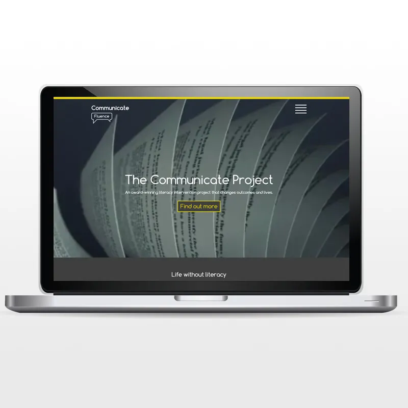
Clean and modern flat design
The Fluence homepage has been carefully considered to simply and quickly capture the immediate interest of a user, while using large typography and video to reflect their branding in a clean and crisp way.
The user journey is simple but fluid, making the site easy to understand for customers that may have little understanding of the English language or the services provided by Fluence. The site does this while giving the clear customer calls to actions to find the services they require or make an enquiry as quickly as possible.

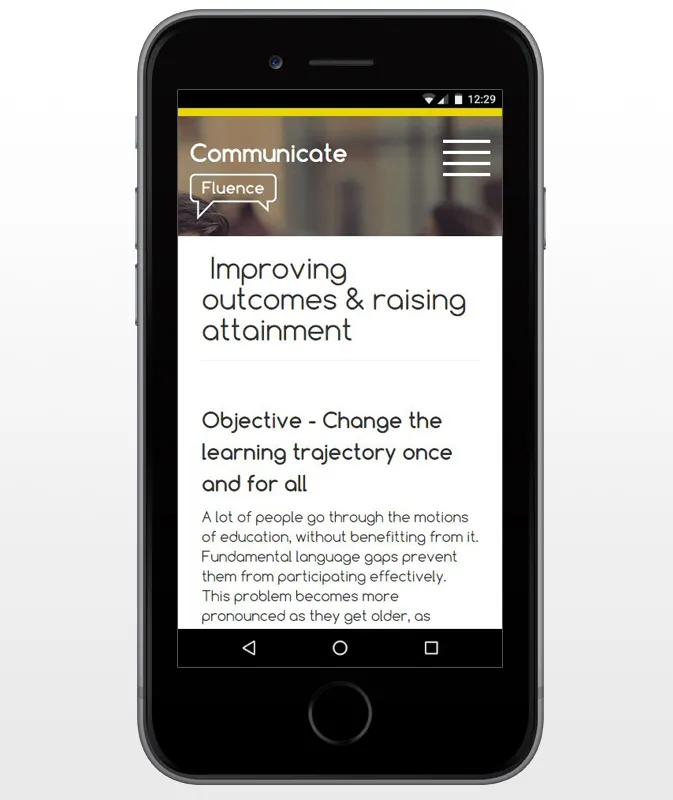
Mobile responsive design
The mobile version of the Fluence site has been developed to have an app like feel. Utilising the size of the screen efficiently - the Fluence mobile site displays the important information in an eye catching, attractive and easy to digest way. The bold navigation button and structure on the site gives the user a clear starting point when browsing the site, and makes it easy to switch between services and browse all important information.

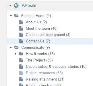
Multi brand site layout and brand architecture
We have developed an intuitive approach to sub branding and brand architecture within the Fluence Website. Fluence have different sub brands within the business that seamlessly link into one main website - They are all different services in their own right and have different offerings, but come together seemlessly under one umbrella. This enables customers to transist and differentiate between services seemlessly, whilst still aware they are interacting with the Fluence brand.

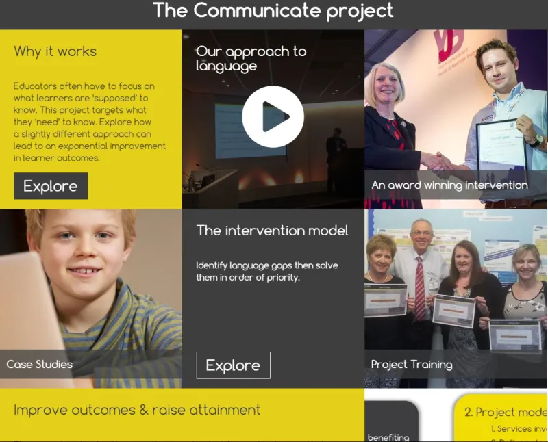
Flexible service pages
Each of the services pages incorporates an easy to manage metro design or 'Grid Format', whereby the users can effectively interchange between text panels, videos, images and further information sections - Giving them the flexibility to customise each service in the way that they want to.
The flexible grid system is fully responsive to tablet and mobile devices, allowing Fluence to customise their calls to action and messaging not just quickly, but in a way that looks great for each sub-brand too.

Fast load times
The Fluence site uses many video sliders and large images. The site employs asynchronous loading techniques, image optimisation and caching to vastly reduce load speeds, improving overall user experience.

