Selling the Services of a Leadership Expert
The Coni Judge website is designed to attract introverts in leadership roles (particularly women), who need help to thrive in a world that celebrates extroverts. With a number of services, from one-to-one coaching to event speaking, the site shows users what’s on offer and why they might need it. Users can read through the content to discover more about Coni Judge, or easily get in touch to enquire about the services available.

Clean, On-Brand Design
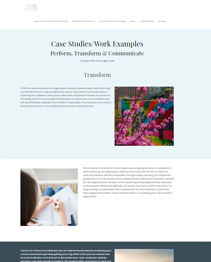
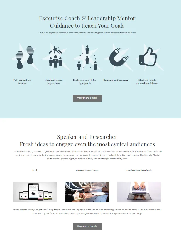
As a website for a personality rather than a conventional business, the design of the site had to match the client’s personal brand. To do this, we kept the design professional, clean, and with a more feminine approach. This minimalistic design lets the site’s content take priority, encouraging the user to focus on what’s being offered without struggling to navigate through unnecessary features. However, in order to keep the website engaging and to break up the large amount of text, the site is very visual. The text size and font is varied to split up content sections, which are often placed on different coloured backgrounds, making the content easier to digest. There are also images, including icons and photographs, to make the website more appealing.

Value Messaging and Calls to Action
The content of the website is based around value messaging. To do this, three criteria are accounted for:
- The target audience
- The value of the service to the audience
- How the service is different to those offered by competitors - why the audience should choose our client
Through testimonials from past customers, information about our client’s expertise, and case studies, the value of the services are shown to the audience in a clear, concise way. Throughout the content, there is also a heavy focus on calls to action, encouraging the audience to engage further with the website or directly with our client. Buttons are used, making it easy for users to complete an action simply by clicking. From ‘Get a Quote’ to ‘View More Details’, the buttons use instructive language to convince users to proceed.


Editable Via WordPress
To make sure the client still has the freedom to make adjustments to their website and add updated content, WordPress was the obvious choice to build with. This platform is the most popular in the world and makes editing easy - even for users with no website building experience. With content that’s likely to change, such as the client’s own achievements and new case studies, easy editing was a priority. It also has continuous support and updates that keep the website up-to-date and secure.
301 Redirects
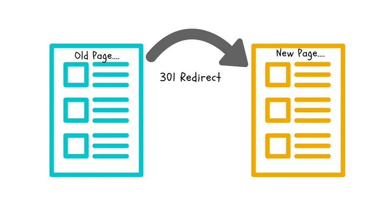
For any inbound links from the old URL of the client’s website, we set up a series of 301 redirects. This sends the user to the new URL, preventing broken links, 404 error pages, and a loss of potential customers. It also means that the previous work that went into building inbound links for SEO and acquiring new clients isn’t lost. Aside from this, 301 redirects are imperative for improving domain authority, helping the website stay relevant in the eyes of search engines so that those who need the services can find our client.

